The Color Room Palette #129
I knew straight away that this Color Room palette would be perfect for a Not-So-Christmasy Christmas layout from the big stack of photographs we took last Christmas. These photographs of Noah were too cute to leave in the pile any longer.
I actually turned the sketch from the palette (pictured at the end of this post) 90 degrees to the right, before flipping it horizontally. I have also expanded the centre section to include four photographs, and replace the tag ends with journaling.
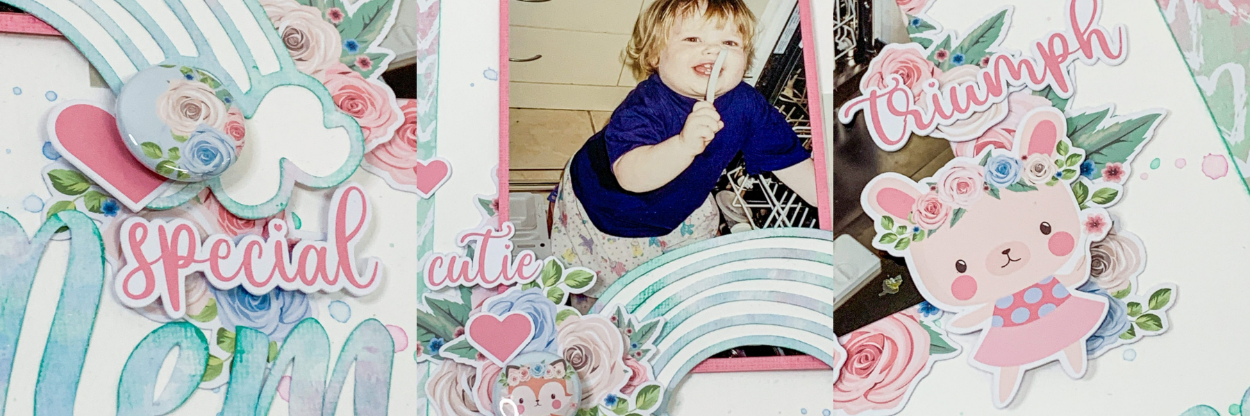
My journaling reads: “Noah just loooves his chocolate especially on his hands!” As the photographs confirm.
I wanted to keep my layout simple and also use my new Octagon Spellbinders that I bought at Scrapbook Fantasies last week (even though it is actually Hexagons that are in – Designwise). I used a light layer of misting, the Octagons, buttons, brads and some eyelets to mimic the embellishment clusters in the palette sketch.
Supplies used:
Patterned papers – Echo Park, My Minds Eye, Teresa Collins, October Afternoon
Cardstock – Bazzill
Ink – Versacolor (Bamboo), Tim Holtz Distress Ink (Forest Moss), Stazon (Olive Green)
Mist – Adirondack Color Wash (Lettuce)
Pen – Tim Holtz Distress Marker (Crushed Olive)
Stamps – Darkroom Door Background Stamps (French Script, Mesh)
Lettering – American Crafts Thickers
Thread – DMC
Clip – Junkitz
Buttons, brads and eyelets – various


Love your layout! Octagons are just as cool as hexagons. Lol.
This is a wonderful take on the sketch and color palette. I love to use photos in a series like this. Your photos are exquisite and really capture Noah’s reaction to chocolate. (Honestly, my reaction would probably be the same.) The octagons mixed with buttons add a delightful dimension and your background really pulls it all together. AWESOME layout.